Brand Product Card
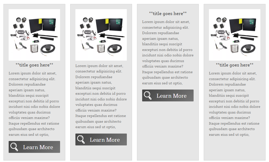
Note: This is how you create a card grid. There can be as much text as you'd like to include. There can be as many card-item div clusters as you'd like to use, they will just wrap to the next row. Each one is a new card. Please always keep the ouside div, card-container wrapped around the enitre code block. On each card, the h3 , the img , the p and the .button can be removed and the card will remain in tact. Any combination of elements can be removed. The image can be a see through png or a jpg and it can be any shape.
This code can be seen here Examples
<div class="card-container">
    <a href="#" class="card-item">
        <div class="bg-white"><img src="#" /></div>
        <div class="card-body">
            <h3 class="centered">**title goes here**</h3>
            <p class="card-text">**brand description goes here**</p>
            <span class="learnMoreBtn">Learn More</span>
        </div>
    </a>
    <a href="#" class="card-item">
        <div class="bg-white"><img src="#" /></div>
        <div class="card-body">
            <p class="card-text">**brand description goes here**</p>
            <span class="learnMoreBtn">Learn More</span>
        </div>
    </a>
    <a href="#" class="card-item">
        <div class="card-body">
            <h3 class="centered">**title goes here**</h3>
            <p class="card-text">**brand description goes here**</p>
            <span class="learnMoreBtn">Learn More</span>
        </div>
    </a>
    <a href="#" class="card-item">
        <div class="bg-white"><img src="#" /></div>
        <div class="card-body">
            <h3 class="centered">**title goes here**</h3>
            <p class="card-text">**brand description goes here**</p>
        </div>
    </a>
</div>